Removable Film Labels
|
|
Time to read 4 min
When designing labels or sticker paper, one of the most common frustrations is finding that the printed version looks darker than the bright, vibrant design on your computer screen. This issue is not a malfunction of your printer or paper. Instead, it stems from fundamental differences between how colors are displayed digitally and how they are reproduced in print. By understanding these differences, you can take practical steps to ensure your printed labels look closer to what you expect.
Table of Content
The biggest reason for darker prints is the difference between RGB and CMYK color modes. Screens such as monitors and smartphones use RGB (Red, Green, Blue), which is based on light. This means the colors are naturally bright and vivid because they are illuminated directly. Printers, however, rely on CMYK (Cyan, Magenta, Yellow, Black) inks or toners. Instead of light, CMYK colors are created by layers of pigment on paper that absorb and reflect light. As a result, prints usually appear darker and less vibrant compared to the same image on a backlit screen.
Brightness vs. Paper Surface
Another factor is brightness. Computer screens are often set to high brightness by default, which makes colors appear more luminous than they truly are. Paper, whether it is matte, glossy, or synthetic, cannot match this illumination. A matte label paper, for example, will absorb more ink and give a muted appearance, while a glossy paper may reflect light but still cannot match the brightness of a digital screen. The difference in surface texture makes printed colors look naturally deeper or darker.
Printer and Ink Limitations
Printers themselves also influence the outcome. Inkjet and laser printers have limits on how much color they can reproduce. To achieve strong contrasts, printers often use more black (K), which deepens the tones and causes the whole design to look darker. This effect is especially noticeable in areas with high saturation or dark gradients. For thermal printing, which is commonly used in shipping labels, the challenge is different: prints may come out too dark or too light depending on the printer’s heat and density settings.
A frequent mistake is designing in RGB mode. Many design programs like Photoshop default to RGB, and unless you switch to CMYK, the final print will not match your screen. Another issue is oversaturated colors. Extremely vivid shades may look great digitally but collapse into muddier tones in print. Finally, neglecting to use ICC color profiles, which are specific settings for different printers and papers, often leads to poor color accuracy.
The good news is that you can take several steps to avoid or minimize these problems. Start by designing in CMYK mode from the beginning. This way, what you see on screen will be closer to the printed result. Adjust your design’s brightness and saturation down by about 10–15% before printing to prevent overly dark tones. Always run a test print before committing to a large batch, especially for labels or sticker paper where color accuracy is important.
In addition, match your paper type to the printer settings. For instance, select “Glossy Paper” if you are printing on glossy sticker sheets, or “Matte Paper” if you are printing on label stock with a flat surface. The correct printer driver settings ensure better ink absorption and reduce unexpected color shifts. For professional projects, consider calibrating your monitor with a color calibration tool so that your screen more accurately represents print colors.
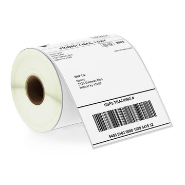
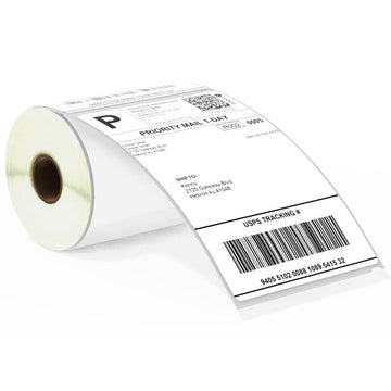
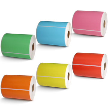
When it comes to labels, the type of material plays a big role. Direct thermal labels are mostly black and white, so the challenge is not RGB vs. CMYK but rather adjusting the print density for clarity. On the other hand, inkjet or laser sticker papers rely heavily on CMYK accuracy. For synthetic materials like waterproof PET or PP labels, ink absorption is different, which can make prints appear darker unless the design is adjusted. Always choose the correct label material for your intended use and run tests before mass production.
To sum up, remember these golden rules:
Design in CMYK mode, not RGB.
Reduce brightness and saturation slightly before printing.
Test print on the actual label paper you plan to use.
Calibrate your monitor for more accurate previews.
Keep two versions of your file: one RGB for digital display and one CMYK for print.
Printed labels often look darker than they appear on screen, but this is not a flaw—it is simply the difference between digital light and printed ink. By preparing your design correctly, choosing the right paper, and testing your prints, you can greatly reduce these color discrepancies. For businesses using labels and sticker paper, taking these steps ensures that your branding remains professional and consistent from digital mockups to physical products.
About Betckey
Betckey Premium Labels is a leading supplier of compatible direct thermal labels, committed to high-quality and eco-friendly products as well as competitive pricing. We offer better products than manufactured original at 70% less price. Now, our Amazon store ranks first in the US, Canada, and Western Europe with thousands of positive ratings. Visit betckey.com and get special discount when purchasing! Sign up now and we'll send you a special discount towards your purchase. By the way, welcome to follow our official @ Tik Tok and @ Youtube accounts to get Betckey’s latest news!