5 Landing Page Examples for Small Business 2023


Landing pages represent a distinctive realm in the field of marketing. Much like an intrepid explorer embarking on a journey to a novel land or uncharted planet, a prospective customer arrives there with the intention of establishing a connection. Their curiosity and excitement are palpable. However, despite this enthusiasm, it's all too common for marketers to take a lackluster approach.

Typically, marketers tend to employ their tried-and-true landing page templates and duplicate the same form repeatedly. But where is the thrill of adventure in this approach? Where is the creative exploration that truly entices visitors to take action and convert?

The landing page examples we're about to showcase encompass various sectors, spanning from B2C to a diverse array of industries and offerings.

Nevertheless, what unites them all is their distinctive designs that are sure to ignite your creative imagination. These examples also incorporate effective best practices that can significantly boost your lead generation efforts.

What Contributes to The Effectiveness of A Landing page?

Before delving into examples, it's important to highlight some of the common traits shared by successful landing pages.

  • Clear and Concise Value Statement: Ensure there's a clear and succinct value statement prominently displayed above the fold. This helps visitors immediately grasp the purpose of your page.
  • Alignment with Visitor's Expectations: Match your primary headline with the content that prompted the visitor to click and land on the page, such as an ad or email CTA.
  • Social Proof and Testimonials: Incorporate social proof and testimonials to substantiate your claims and build trust with your audience.
  • Singular Focus on a Single Offer: Concentrate the entire page on promoting a single offer, with just one primary call to action (CTA). Avoid distractions that may divert visitors from this goal.
  • Conversion-Centric Layout: Design your page with a conversion-centric layout that makes your CTA stand out. Consider factors like whitespace, color, contrast, and directional cues to guide visitors' attention.
  • A/B Testing: Continuously experiment and test new ideas using A/B testing. Sometimes, the strategies that yield the best results can be unexpected.

By adhering to these fundamental practices, you can increase the likelihood of your landing page effectively engaging and converting your visitors.

1. Zola

Zola is revolutionizing the wedding planning industry as the newest startup to challenge the status quo. Their guiding principle is elegantly simple: Simplify the entire wedding journey for couples, spanning from sending out invitations to embarking on their honeymoon. Zola offers an all-in-one solution for soon-to-be brides and grooms, encompassing an online wedding registry, a comprehensive directory of wedding venues, and a network of trusted vendors.

Details:

  • Free Website Templates: The word "free" immediately catches the eye of potential brides and grooms on the landing page. This powerful word resonates with couples looking to economize on their wedding expenses while still achieving a polished and professional appearance for their wedding materials.
  • Professional Photography: The presence of professional wedding photos on the landing page provides readers with a glimpse of what their engagement photos could look like when incorporated into Zola's designs. It sets a high standard and fuels anticipation for the quality of service.
  • Discount Incentive for a Related Offer: Zola sweetens the deal for customers by offering a discount when they combine their free website with save-the-date cards. This clever strategy encourages couples to bundle services, simplifying their wedding planning process by addressing multiple needs in one go. In essence, Zola allows them to "kill two birds with one stone" while enjoying cost savings.

2. HelloFresh

HelloFresh is a meal-kit company headquartered in Berlin, Germany, with a presence in several countries. It's notable for being the largest meal-kit provider in the United States and for its global reach, with operations spanning across Australia, Canada, New Zealand, and various European countries, including Germany, Austria, Switzerland, Belgium, Netherlands, Luxembourg, France, Italy, Ireland, Spain, Scandinavia, and the United Kingdom. Additionally, HelloFresh is a publicly traded company, reflecting its prominence in the meal-kit industry.

Details:

  • High-Contrast Call-to-Action: The hero section prominently features a high-contrast call-to-action button, which immediately draws attention and encourages action from visitors.
  • Romantic Flourishes: The design elements on the page include romantic touches that align seamlessly with the "date night" offer, creating a visual narrative that guides the viewer's eye down the page.
  • Process Explanation: It provides a clear and concise explanation of how the process works and what customers can expect to find in the box. This transparency helps visitors understand the value proposition.
  • Co-Marketing/Influencer Marketing: Leveraging co-marketing and influencer marketing, the page incorporates photos and quotes from Jessica Alba, a well-known figure, to encourage visitors to convert. This adds credibility and trust to the offering.
  • Effective Use of Blocking: The page utilizes blocking to separate and highlight important sections, making it easier for visitors to navigate and understand the content. This design technique aids in guiding the viewer's eye and maintaining their focus.
  • Real and Relatable Imagery: The imagery used is real and relatable, aligning perfectly with the messaging and creating a connection with the target audience. This authenticity enhances the overall appeal of the page.

3. Branch Furniture

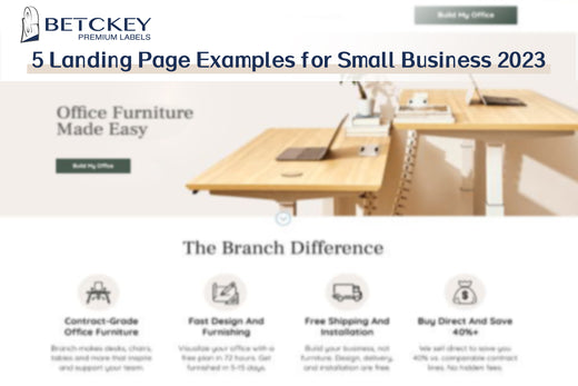
We all know the challenges of furnishing a home office. It can be quite a task to find desks, chairs, and tables that suit your preferences online, and that was just for a single workspace! Branch Furniture recognizes the difficulties office managers face in this regard, which is why their landing page provides immediate reassurance that you've come to the right place. Their service streamlines the process of designing, shipping, and installing office furniture, making it a fast and hassle-free experience.

Details:

  • Powerful Headline: The headline, "Office Furniture Made Easy," is concise yet impactful. In just four words, it clearly defines the target audience and communicates the unique selling proposition (USP) – the promise of simplifying the office furniture procurement process.
  • Clever CTA Copy: The page features multiple calls to action (CTA) buttons, each with distinct copy. This approach guides visitors through the next steps while allowing them to choose between actions like "Design My Office" or exploring specific products. It provides a more personalized and engaging user experience.
  • Expert Consultation: Emphasizing the collaborative aspect of the shopping experience, the landing page highlights the availability of a free design consultation and includes installation fees. This showcases Branch Furniture's commitment to assisting customers throughout the process, making it less daunting and more accessible.


4. Airbnb

I guess I don’t need to introduce Airbnb. Let’s go straight to the details:

Details:

  • Interactive Slider Tool: To illustrate the potential earnings from the Airbnb offer, an interactive slider tool is used. This allows visitors to visualize how much they could make by becoming an Airbnb host, adding an engaging and dynamic element to the page.
  • Highlighting Major Benefits: The landing page prominently showcases the three major benefits of using Airbnb setup. This helps visitors quickly grasp the advantages and value of the service.
  • Host Protection Information: Airbnb's commitment to host safety and protection is detailed on the page, addressing potential concerns and instilling confidence in prospective hosts.
  • Frequently Asked Questions (FAQs): FAQs are provided to address common queries and provide additional information. This enhances the user experience by offering quick access to relevant information.
  • Contact Option: The page offers an easy way for visitors to get in touch with a real person for further assistance or inquiries, demonstrating a commitment to customer support.
  • Friendly Imagery: The use of friendly, smiling images of people adds a welcoming and relatable touch to the landing page, making it more personable and approachable.

5. Fast Mask

Fast Mask specializes in the production and sale of bandanas and face masks explicitly crafted for use during motorcycle rides, ATV excursions, or cycling adventures. This landing page is strategically tailored to attract enthusiasts of adrenaline-fueled activities. It proudly presents a selection of striking designs available for your mask while also illustrating the various versatile ways in which these masks can be worn.

Details:

  • The landing page smartly emphasizes its best-selling products by featuring just five of Fast Masks' most popular designs. While the website offers a wide range of over 100 different designs, this approach prevents overwhelming visitors with an extensive product list. Instead, it provides a representative sample, showcasing diverse styles, from a Canadian flag to a Spider-Man mask, offering a glimpse into the product variety without cluttering the page.
  • Moreover, the landing page demonstrates a deep understanding of its target audience – thrill-seekers who engage in activities like motorcycles, paintball, snowboarding, hunting, and other extreme sports. This audience-centric approach ensures that visitors instantly recognize the relevance of the page to their interests and preferences, enhancing the user experience and increasing the likelihood of conversion.